Designing Domesticity Our Home Projects Food Services Shop About

Loving This Week

It's been awhile since I've shared an edition of "Loving This Week", but with school back in session for our big girl and our little lady getting ready to start pre-school, it's time for me to get back to the business of blogging.


That's right, school is back in session and now I have a couple more quiet hours in the day (TGI nap time!), so I am finally able to tackle some of those much overdue updates on the pages of Designing Domesticity.

1. Check out the changes under About, Our Home, Projects and Food.
Yes, I have been a busy, busy bee in the 4 days since school started. 

More free time means more home projects (music to John's ears, right, honey?) coming my your way. Because as you know, everything I do, I do it for you. Cue Bryan Adams. Those of you that know me personally are probably laughing because you think I might actually like that song. Yes, I do have the worst taste in music. But, I digress, back to those home projects like our little lady's room update and the girl's shared bathroom update and maybe even some small updates to the powder room. Maybe, just maybe.

2. Speaking of updates, did you see this post from Holly Mathis Interiors? The one where she shares her quick bathroom fixes. Love that vintage nude sketch.

3. Or how about Kris' post from Driven by Decor? The one where she shares a fabulous new online lighting source. So many amazing options - I've got lighting on the brain- like all the time - so many of our lights need replacing. Broken record…

4. And finally, is it just me or does it seem like every blogger has a book coming out these days? All very well deserved, of course, these are among the best of the best. Fortunately for us, Andrea from the Cottage Market kindly gathered 9 of the best books that should be gracing our bookshelves right now. Check it out.

Have a great, looooong holiday weekend everyone!

until next time,
Read more ...

Caramelized Peach Honey Cinnamon Ice Cream

You know what's good? 
Summer Southern peaches. 
This ice cream.
Cleaning up after this photo shoot.


Yup. I did it again. I created my own ice cream flavor and thought it was good enough to share with you all.

Here's what you do:
Start with a standard no-cook vanilla ice cream base, I have always used the recipe that came with my Cuisinart Ice Cream maker, here.
1 c milk
3/4 c granulated sugar
pinch of salt
2 c heavy cream
1 tbs vanilla extract 

1. Combine the milk, sugar and salt in the bowl of a mixer/blender and blend until the sugar is dissolved. Stir in the heavy cream and vanilla extract. Refrigerate for 1-2 hours or overnight.


2. Meanwhile, peel and chop 3 ripe peaches into bite sized pieces. Add to a heavy bottomed skillet with 1/4 brown sugar. Cook over low heat until rich, syrupy and caramelized about 20 minutes.
3. Once super yummy and caramelized, stir in 1/8 tsp cinnamon. Cook 5 minutes more to meld flavors then remove from heat and cool to room temperature.


4. Add the ice cream mixture to frozen ice cream maker tub, churn as directed, about 15 minutes. As the ice cream mixture begins to reach your desired consistency add in the peach mixture. Continue to churn until almost complete than drizzle in 2 TBS honey (or more depending on how ripe and sweet your peaches are). 

5. Serve immediately for a "soft serve" style or remove from tub, place in freezer safe container and freeze for a harder style ice cream.


This ice cream has it all-- the fresh ripe flavors of summer mingle with the warm and comforting spice of cinnamon. For an extra treat drizzle more honey over your scoop(s).

More than one scoop - who does that? Oh, yeah, it's me. 

Enjoy!

until next time, 
Read more ...

A switch, a desk and some freshening

As of today, school is back in session! 
So, it only seems fitting that I'd share a little update in our new 1st graders bedroom. This change didn't really come about because of school, per say, but it does involve a desk...so there you go. 
Why not?

old dresser

This is how we started in Tessa's room. 
Keen observers may have noticed that the white dresser that served as her beside table recently moved to the porch.
Who doesn't love good ol' multi purpose furniture - you know this girl does! 

new home on the porch

The dresser is now working perfectly on the porch holding napkins, candles, placemats and such, which makes room for a new addition in Tessa's room. 
Of course, I mean 'new' in the sense that it's new to her room, but not new to this house or me, for that matter. 


It's my childhood desk. 

As you know, I'm totally in support of using good quality, solid wood (antique, if possible) furniture in my home - and I love how the dark wood plays off the white bed frames (you know how I feel about matching sets) - but even I can admit that this feels a little "mature" for a kid's room.


Never fear, it's nothing some good quality accessorizing can't handle.  Starting with this too cute teal ottoman I found on clearance (it's ok to hate me a little) at Target for less than $25.

Such a good deal I got it in pink and teal. Like a mom of two girls can't find a place for a hot pink ottoman, please.

I love the teal against the dark wood, how it helps to break up all the pink in the room, and brings out the blue in the pillows. Plus, the youthfulness of the ottoman really freshens up the whole look of the dark, heavy 'mature' desk.


Once the little seat was in place, it felt kind of natural to kit out her desk with her favorite (of the moment) books, workbooks and journal all corralled by another youthful punch in the form of the owl bookends.

Who remembers the owl lamp and monogrammed lampshade? One of my first projects some 3+ years ago.

Now, do I really think she's going to sit in her room and do her homework? No, I am not delusional. But, she does like to spend some time alone, away from her little sister, from time to time and I hope she'll enjoy this new little spot of her very own.


A couple of take-aways from all of this:
1. hand-me-downs are awesome.
2. mixing wood finishes adds warmth to your space and helps to keep it interesting. NO matching sets.
3. adding the right accessories can freshen even the most 'mature' of furniture.

linking in with: 

until next time, 
Read more ...

Back Porch Makeover Details

As promised, I'm back with more detailed shots of the porch for you. Yeah, I'm good like that. Following through and what have you.


The first notable change from the "after" shots I posted a couple weeks ago are the terra-cotta planters and potted greenery. Remember my 'porch spinning' post where I decided to go in a more European direction instead of the original tropical idea - yup, followed through on that one, too. Good like that.


Loving the groupings of 3 on each end of the porch - thank you, Brian Patrick Flynn for the inspiration.
Planters are from Home Depot, surprisingly. The hollies (which we have been told are more forgiving than boxwood in this climate) are from our beloved Growers Retail Outlet in Pineville. 


We divided the porch into two sections. The first being dining, which holds the, obvious, dining table and chairs. Table, chairs, and cushions are all from our old patio in Chicago. We have grand ambitions to get something a bit more permeant and less patio-esque here, but that probably won't happen until next season. After all, we are nothing if not budget conscious around here.


The white painted dresser was a bargain at less than $20 ages ago. It's had several lives in our homes over the years from TV stand, to bedside dresser, to now porch server. For the moment, it holds my growing collection of ferns and some ambient light - because what's night time dining without a little candlelight! The framed art is my sneaky solution to a hideous out-dated intercom system. Hung it right on top of the box. I'm so clever :)


As if you couldn't guess, the other side of the porch is dedicated to our seating area. 


Again, we've just used the furniture that we had in our screened-in porch in Chicago. The loveseat is hopelessly small, but the chairs work just fine. We'd love to replace it all for something a bit more "all-weather" friendly, but again, that will probably be in the season(s) to come. 
The poufs were a purchase I made from HomeGoods before we even started this project - I was initially on the fence about them, but they've proven their worth time and time again. So glad the woman behind me in line threatened to purchase them if I didn't…
Black and white stripped pillows are from Ikea, purchased through Amazon Prime - thank you, free shipping! The rug is a polypropylene wonder from Overstock. Amazing that outdoor rugs can look so indoor-y now. 


The hanging pots - were do I even start? Love them, first off. Slim pickings in the plant world this time of year, but I could see a more privacy achieving boston fern here next year. Speaking of next year, we'd also love to add rail planters here to further along that privacy screening I mentioned earlier. 
Thanks again to Flynnside Out Productions for the inspiration here. 
White garden stool came from Home Depot at a steal, another lucky late in the season find. 


Did I mention my love affair with ferns? I think this is the 3rd or 4th variety that I have on the deck. It's becoming a bit of a problem really. This one's just so soft, dainty, and airy. Just can't help myself...


As you can tell, we've got more plans for our new backyard hangout and I'm sure it will be changing often over the coming months… so, if you need me, I'll probably be right here. Brainstorming and daydreaming. By far, my favorite spot on the deck…at least for this week. 

linking in with:

until next time,
Read more ...

Back Porch Before and After

It's official, I've dragged this back porch makeover project on for long enough. Not that it's entirely my fault - the construction portion of this project did take almost 9 weeks - but I'm finally ready to show the before and afters with you, today.


Here's the before, if you recall. 25' wide x 10' deep with a "seen way better days" forest green awning. 


And, the after, which includes an extended deck (now 25' x 15'), wrap around stairs, pergola and polycarbonate roof
Can we just say, it's a bit of an improvement!


Of course, no 'before and after' is complete without a side by side comparison.


There is so much we love about our new deck, but one of the best things is that we no longer have to grill like this when we are in the yard. Yeah, for stairs! And access to the yard. 

I'll be back later in the week to share more details (read about them here) about what's actually on the deck. Nothing like an end of summer back porch makeover, right? 
Hey, better late than never! That's what I always say. 
Of course, we still have months of summer-like-temperatures ahead of us. Hello, 95+ all week. 

sharing with:

until next time, 
Read more ...

Design Crush

We have house guests this week and I was a bad blogger and didn't prepare anything (in terms of posting) in advance. But, that doesn't mean I've forgotten about you all - in fact, I can't stop thinking about you - and how much I'm looking forward to getting back into the swing of the school schedule and posting more regularly. So, I wanted to pop in really quickly and share my newest and latest design crush. 


Please allow me to introduce you to Brian Patrick Flynn from Flynnside Out Productions.

Ok, obviously, I am in the middle of our deck remodel so there is a reason that this image stopped me in my tracks. But, it isn't a fleeting attraction because once I started exploring his website, I couldn't stop. I love so much about his work. 

From this image alone (second floor deck): the curtains, the hanging baskets, the rail planters, the potted greenery, the lights…need I go on?!?!?


The lower level deck of the same mountain house project is also stunning and completely approachable. Like someone you know could actually have designed it themselves, and actually lives there, and, heaven forbid, actually uses it.
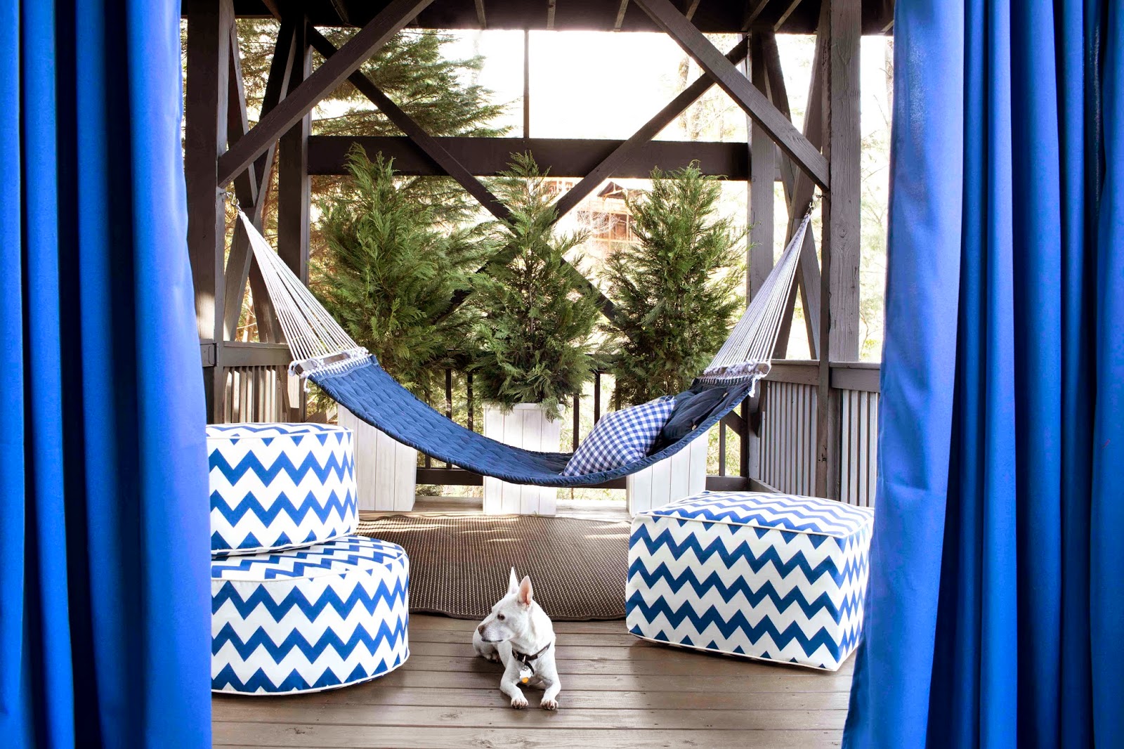
Quilted hammock, chevron poufs, more potted greenery, and the dog - I mean, really, it's almost too much. In a good way, of course. 


Now, if outside spaces aren't your thing, never fear because he has plenty of interior spaces to fall in love with as well. Like this not fussy, formal dining room
Our new home in Charlotte has a formal dining room, which of course, we have used 4 times in the last year. In our last home in Chicago, we transitioned away from the formal space and utilized it as our everyday dining space…this image has me wondering what I can do in our current formal dining room to get more use out of it.
Loving those built-ins with the pops of brass against the dark backdrop. And don't even get me started on the captains chairs - jealous.

Anywho, from his blog to his portfolio there is just so much to take in and get inspired from. Doesn't hurt that his writing style has me giggling like a school girl, either. 
Enjoy!

until next time,
Read more ...

Open the Door to Symmetry

So, did anyone notice anything odd about that last picture I posted of our new outdoor deck space?
No. 
Ok, well, let me spell it out for you. After all, I do realize you might not be quite as obsessed invested in this project as I am.


Can someone please tell me why this house was built with a super short door next to a super tall window? I mean, it just doesn't make sense to me. Does it bug you as much as it bugs me?

My original thought was to have a transom window installed over the door to provide that much needed sense of symmetry.
But…


Then I saw this picture from Country Living. And I thought, I'd love to have more access to our new porch and really open the whole back of the house.

In other words, replace that super sized window with another set of french doors.

Obviously, it's not that easy. There is a lot to think about. How will it affect the layout of both the porch furniture and the den furniture? Can both spaces truly function well when they have essentially lost a wall?


Step 1: rearrange the den. 
Clearly, nothing has been staged/arranged/edited here. All I did was move the couch out from under the window and flank the fireplace with our existing chairs.

Guess what. I don't hate it. And neither does John. In fact, we kind of like how it gives the den it's own identity instead of feeling like a weird extension of the living room. 

The previous owner had their couch under the window and so did we. We never even tried it any other way until we had a reason. Now we are so happy we did. 

The real take away from this: try all the possibilities to find what works best. Even if it's always been that way. After all, your biggest loss is only the time is took to move it.

As for the doors, we are still deciding, so definitely let us know your thoughts in the comments section below. 

until next time, 

Read more ...

Gimme Shelter, For Real This Time

We're back, baby. As of last Sunday. And...it is good to be home. For all the normal reasons, but also because our back porch makeover madness is officially over. 
O.V.E.R. 
That's right! Sunday night, as we pulled into the driveway, both John and I were pleasantly surprised to find that the polycarbonate roof had been added to the pergola over our back porch.


Here it is. 
What's that you say? You can't see it. 
I tell you, that's just music to my ears!
I was so worried about the polycarbonate roof, I thought it would be awful and unsightly and more awful, but to my surprise it's none of those things. Instead, it's practically invisible. 


Knowing it's pretty easy to make things look great from far away, here's a closer look. 
As you can see, the pergola is level. On top, the contractor added a 4x2 ripped to create a small angle going away from the house. This will keep water off the roof and flowing down over the stairs. 
The new ripped 4x2 creates the support for the polycarbonate panels. 


Moving in even closer, you can see that we selected a milky white polycarbonate. 
1, because it filters the light, but doesn't block it.
2, because it slightly camouflages the debris that inevitably falls on the roof. 
3, because it blends into the white pergola. duh.

Each polycarbonate panel is approximately 4x8. They are attached in a grid pattern with rubber screws. The seams are siliconed, taped and sprayed with adhesive. Creating, what we hope will be, a water-tight roof. 


I guess all my fears were for not. I officially apologized to John, who first provided this idea/solution, and told him he is the mastermind he has been trying to convince me he is. 

Moving right along…you can see we were really excited to get the porch set up. Got the old wicker out of storage (aka the garage) and plopped it on up there. Added old pillows and everything. We've got a couple more tweaks planned, but for now we are soaking up the unseasonably cool temperatures and loving our back porch. More details to come…

until next time, 


Read more ...
Related Posts Plugin for WordPress, Blogger...

Lijit Ad Wijit