Yesterday I announced our big news - our kitchen renovation is finally scheduled and due to begin in mid April. I really couldn't be more excited.
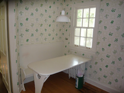
Here are a couple photos from before we bought the house - so you can get a true understanding of what we are dealing with!
Dated wallpaper, laminate counter tops, a corroded and rusted sink, cabinets that don't close properly.
An old-school fridge sticking out into the middle of an already small kitchen space.
Limited counter and prep space due to an ill-placed door and window.
A cute and very functional eat-in nook, but the space could be used more wisely.
I'm hoping these photos give you are real sense of the awkwardness of this space as well the lack of functionality.
Here's a quick aerial drawing that will also, hopefully, add to your understanding.
And now for the wordy part - stay with me here!
Our kitchen is not a big space, measuring about 9.5' x 14.5'.
Some of the major architectural flaws are the placement of the backdoor, the back window, both radiators, a lowered ceiling in the addition (everything to the left of the stove and the nook area), a beam that can not be removed or hidden separating the original kitchen from the addition.
The list could probably go on, but again, I did say major!
So, here is what we are thinking for the new layout...
(again, just a quick drawing to hopefully help you understand what I am talking about)
Along the side wall exiting to the back porch, we'll be centering the door in the space and removing the back window. The wall with the range and sink will become a straight run instead of the L shape shown previously. This will maximize the counter space and in turn the prep space.
The area with the fridge actually bumps into the dining room about 10 inches (you can kind of see it in photo 4), which will allow for a counter depth built in fridge and pantry to be placed in this space.
On the wall to the right of the door to the dining room, the counter depth will only be 18". Again, this is all in an effort to maximize space.
So, what do you think about our new layout?
Like I said, we didn't come to any of these decisions overnight. We had plans and then we changed them and then we did it all over again. We've definitely had to compromise on a couple of things (perhaps I'll share those in another post).
I'd love to know your thoughts - do you think we are headed in the right direction?
Until next time,


