Designing Domesticity Our Home Projects Food Services Shop About
Showing posts with label paint. Show all posts

Dark and Hairy Progress {Powder Room Reveal}

It's no secret that I'm feeling super inspired by the dark room movement at the moment {I posted about it here and here}. So, we took to the walls to make it a reality in our own home. 
Welcome to the newly navy {BM Hale Navy to be exact} powder room. 


Can I just stop for a moment to say how incredibly hard it is to photograph a tiny space with no natural light and dark walls while not using a flash. Zoinks, these are some tough photos. Sorry 'bout that!

Anywho

We are loving all that drama! The color is much richer in person, a navy with a hint of a deep purple undertone. 


As if you couldn't have guessed, I did manage to score and incorporate a bit of faux taxidermy to the space. More on how I glamorized this little guy later in the week...


Although our powder room is not large, I was able to carve out a corner for this sweet, little accordion table filled with some powder room essentials. 
The stargazer lily adds a wonderful pop of color in here - almost inspiring me to add a hot pink towel. 
Perhaps...


For the moment, I've added a tonal towel in a shade of teal blue that contrasts nicely again the navy walls while not standing out entirely to steal the show in this sparsely decorated room. 


A new light fixture and a fun soap dispenser is on the wish list, but for now, this bold statement of a wall color is making me more than happy.

Hope you had a great weekend! And tell me, how do you feel about dark walls?

linking in with:

until next time, 
Read more ...

Paint Pickin' Progress

I've been going on and on about our design plans for the new house...you've seen our house, kitchen, fabric, and wallpaper inspiration and now I think we've made enough progress to share our paint progress.


Feast your eyes on this, baby! I know, shocking, right? Usually, I am all yellows, greens and corals - warm and cozy. But, in this house, I wanted to try something different entirely. A lighter pallet of neutral, yet warm tones. Deep blues, and green toned grays. (Blue toned grays can come across too cold for me.) 
I'm excited about this pallet, even though Mr. DD thinks it's not enough color and will be too sterile.
Hey, it's only paint - why not give something different a go, if we hate it, we can always repaint.


Upstairs will be a bit different. With two little girls, one of whom is extremely opinionated, I didn't have too much freedom to pick whatever I wanted. 
Although there are a lot of colors here, the linking undertone is gray, so hopefully the upstairs will flow as nicely as the lower level. Despite the fact we'll have one pink room!
Tip: Even if colors seem disjointed, make sure your undertones are the same and you'll be just fine. 

So, tell me, do you think gray can be warm?

until next time, 
Read more ...

Custom Paint Colors

Have you ever found yourself wanting to bang your head against the wall while attempting to find the perfect paint color? I swear, I wanted to do just that with our dining room color. 

Moroccan Spice

I've said from the very beginning that I wanted a coral red. And a coral red I set myself on finding. First, I tested BM Moroccan Spice, but after I settled on a fabric for our window treatments, my original inspiration color seemed too dark. Back to the drawing board...

Adobe Dust

Next up, was BM Adobe Dust. The perfect peachy compliment to my window coverings. But, on the wall, it seemed too fleshy to me. Not a love match, that's for sure. 

Golden Gate

Then, I came across two colors that were almost identical when compared side by side. I decided to test them both. BM Golden Gate had more of an orange undertone, which I thought I wanted. But, again, on the wall, it seemed too pumpkin-y. I do like Thanksgiving, but not year round. 

Coral Bronze

Onto the BM Coral Bronze, which is a color I pulled from the massive wall of samples at the paint store not once, not twice, but three times. It had to be a winner. But, once again, on the wall it didn't look the same at all. It was too pinky/rouge. No way I was convincing Mr. DD that this was our next color. 

At this point, I really wanted to throw in the towel. So much so, that I went back to the paint store and picked up three samples of gold. All very pretty and would have looked perfect in the room, had the rest of my house not already had a lot of yellow and green.


BM Crimson

In an act of final desperation, I went back to the paint store, with both kids and my paint sample to plead with the very nice lady behind the counter. I told her my plight. I told her about my blotchy walls. I told her how I had practically paid for a gallon of paint already in sample pots. I told her I was fed up. I told her this was my last ditch attempt. 
And then I said, you see, I love the BM Coral Bronze, but it's a little too pink. And, I love the BM Crimson {next on the paint sample strip}, but I'm worried it's going to be too dark, too bricky red. 


To which she replied...
No, problem, let me see what I can do. I'll take a look at the formulas of both, do a bit of tweaking and see what we come up with. 
I couldn't believe my ears. 

And, I really couldn't believe the color she came up with. 
And, my smile almost broke my face when she told me there would be no extra charge for the tweaked sample.
I had no idea that custom color creation was even an option. Did you? 


I'm sure you can guess the rest of the story. I ran home, slapped up my sample and it was love at first stroke. 

Come back later in the week to see the full wall reveal and some before and after shots. So exciting.

until next time, 


Read more ...

Chip It

Chip It....the new color selection tool by Sherwin Williams.  
Download it to your computer, then use the software to receive custom color recommendations.
What a brilliant idea, right?


We're trying to decide on a color for our dining room at the moment, so why not give it a try. 
My jumping off point: window covering fabric.
Scan it up, baby.

We're hoping to highlight the coral/orange color, so here's what we came away with...


Interesting. Three different colors all pulled from the same fabric. Of course, I did scan three different images of the same fabric. So clearly, this is subjective to your image. 

Unfortunately, none of these are going to be the right color for us. Back to the drawing board. I guess there's no easy way out for sampling colors...we'll just have to rely on old faithful. Sample pots. And blotchy walls. 

So, tell me. Have you used the Chip It tool with much success?

until next time, 
Read more ...

Armoire Inspiration

As you know, our living room has seen it's fair share of changes as of late. 
She has received a new color scheme, window treatments and pillows.


Now, my biggest obstacle to date - that rustic pine armoire. 

Here are a couple of my inspiration pictures so you can see where I am heading.


 via


To be honest, I'm not that experienced in painting furniture - but I'm going to give it a go!

I'm starting with a new product for me, Old Fashioned Milk Paint, and going from there. Milk paint is know to be a truly "green" paint, all natural and won't harm the environment.

If you'd like to learn more about milk paint, click here.

We'll see where this adventure takes me! 

Until next time, 
Read more ...

New Color Scheme Reveal

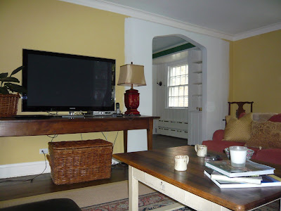
Last time I shared our new color scheme plans and how I hoped to create flow within our newly opened living space. Well, we had a whole weekend full of cold temperatures and loads of rain - so we got a jump start on our new color scheme! 

Check out the before and after and let me know what you think!


After - new living room color


Before

After - new opening with new color in breakfast room


Before - breakfast room color
Thoughts on the new color scheme?
These colors are definitely out of my comfort zone, as you can see I tend to choose warmer, more saturated colors - but I am enjoying the new lighter scheme so far.

As I am sure you can also tell, these rooms are literally freshly painted and in need of finishing touches.
We have trim to install, artwork to hang, and curtains to try out.
It should be a fun week!


I also need to decorate around this monster TV! 


Linking in with Met Monday.

Until next time, 
Read more ...

Creating Flow with Paint

Now that we have opened the wall between our breakfast room and our living room, having good room to room flow is more important than ever.


Here you can see the existing deep yellow color of the living room, that opens to the dark green of the breakfast room. 


Given the need to repaint the new arch area anyway, I figured this could be the perfect time to lighten up our pallet and work on the room to room flow.

Mr. DD totally agrees - any opportunity to repaint one of the biggest rooms in our house, right? 
Oh wait, that is me talking!


So, when trying to create a color pallet for your home - where to start? 

In my case, I am using our dining room wallpaper. It's bold and quite the statement maker. 
We inherited this paper with the house, and although I didn't really like it at first, it has certainly grown on me and we have no plans to remove it anytime soon.

Beacon Hill Damask, Benjamin Moore

The other main factor I am taking into consideration is our foyer/hallway color, Beacon Hill Damask by Benjamin Moore. It's a nice neutral with yellowy green undertones. The foyer/hallway can be seen/accessed from every room in the house - so it plays a major roll in the overall color scheme.

Weston Flax, Benjamin Moore

After looking over many a color, I'm leaning toward Weston Flax by Benjamin Moore. It's a much lighter yellow than what we currently have and more in keeping with the foyer color, while still working with our existing furniture.


If you've been reading this blog for awhile, you probably know how much I love green - this will be my accent color. Proof as seen above!!
Picking similar colors that are featured in artwork and accent pieces from room to room is a great way to create flow.

Guilford Green, Benjamin Moore

Speaking of green, we are planning on toning down the green in our breakfast room to something more mellow, like guilford green by Benjamin Moore. I'm really looking forward to viewing it from the breakfast room into the living room - especially how it will frame our couch.

I'll either carry this color through to the kitchen or choose one shade lighter - TBD!

We're eager to get the new color scheme underway, even though we won't be moving back into our breakfast room for at least another month!

What about you? 
Any secrets to creating good room to room flow in your home?

Until next time,
Read more ...
Related Posts Plugin for WordPress, Blogger...

Lijit Ad Wijit